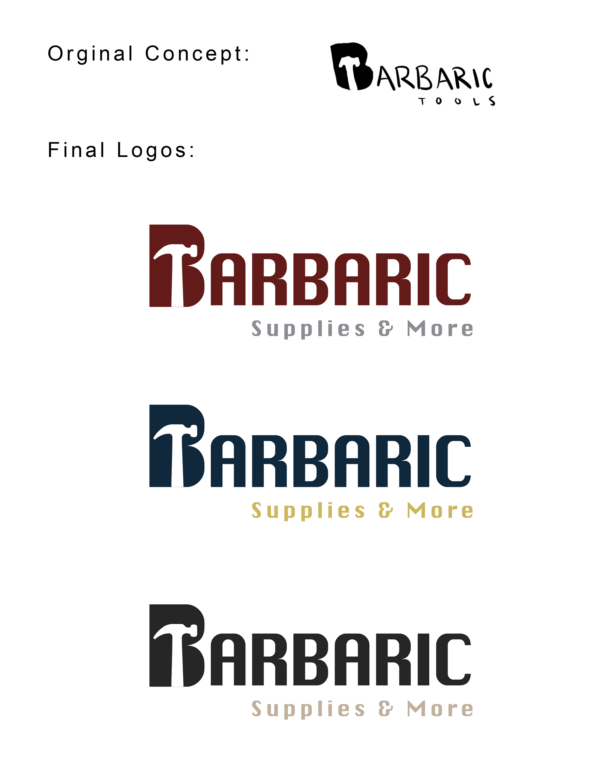
The Barbaric Supplies & More logo animation is designed to be bold, fierce, and unapologetically strong, just like the tools it represents. The motion begins with raw, impactful energy, evoking the spark and grind of metal-on-metal, symbolizing power and resilience. As the logo builds into view, each movement feels deliberate and forceful, reflecting the strength and reliability of tools built for real-world, everyday projects. This animation embodies the spirit of hard work, precision, and rugged performance, everything the Barbaric name stands for. This brand design is not currently used and is a self-project/growth experience.