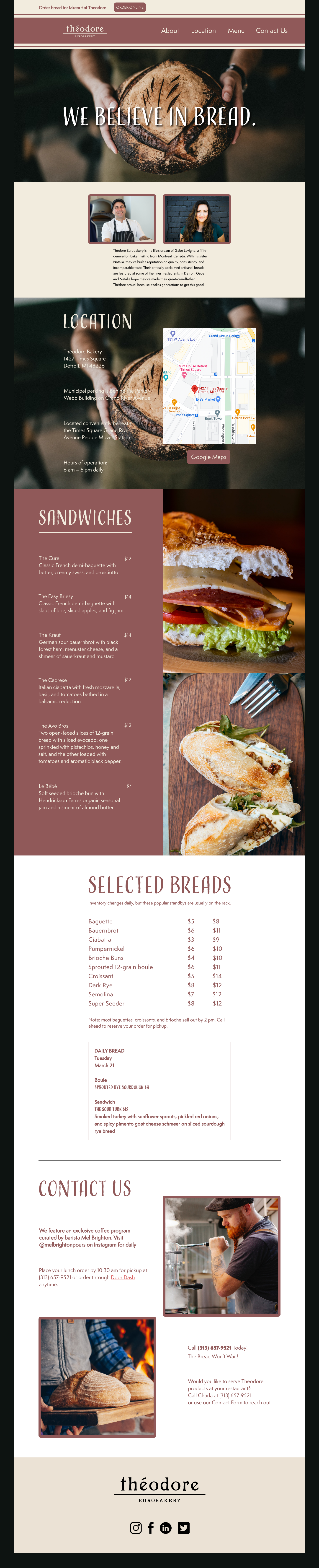
The client requested a professional website to be built for "Theodore Eurobakery." My first step was gathering a general understanding of the demographic and company goal by analyzing the creative brief. One factor that helped me get started designing my first-ever website is looking at other bakery sites that shared a similar aesthetic to what I intended. On a quick side note, the reason that the hero image and the image behind the “location” part of this website is the same is that it represents a parallax. One of the hardest, most time-consuming aspects of this assignment included the wireframes. The client wished to see three different possibilities for the website. I provided different fonts and composition styles, which also helped me decipher the best one all around.
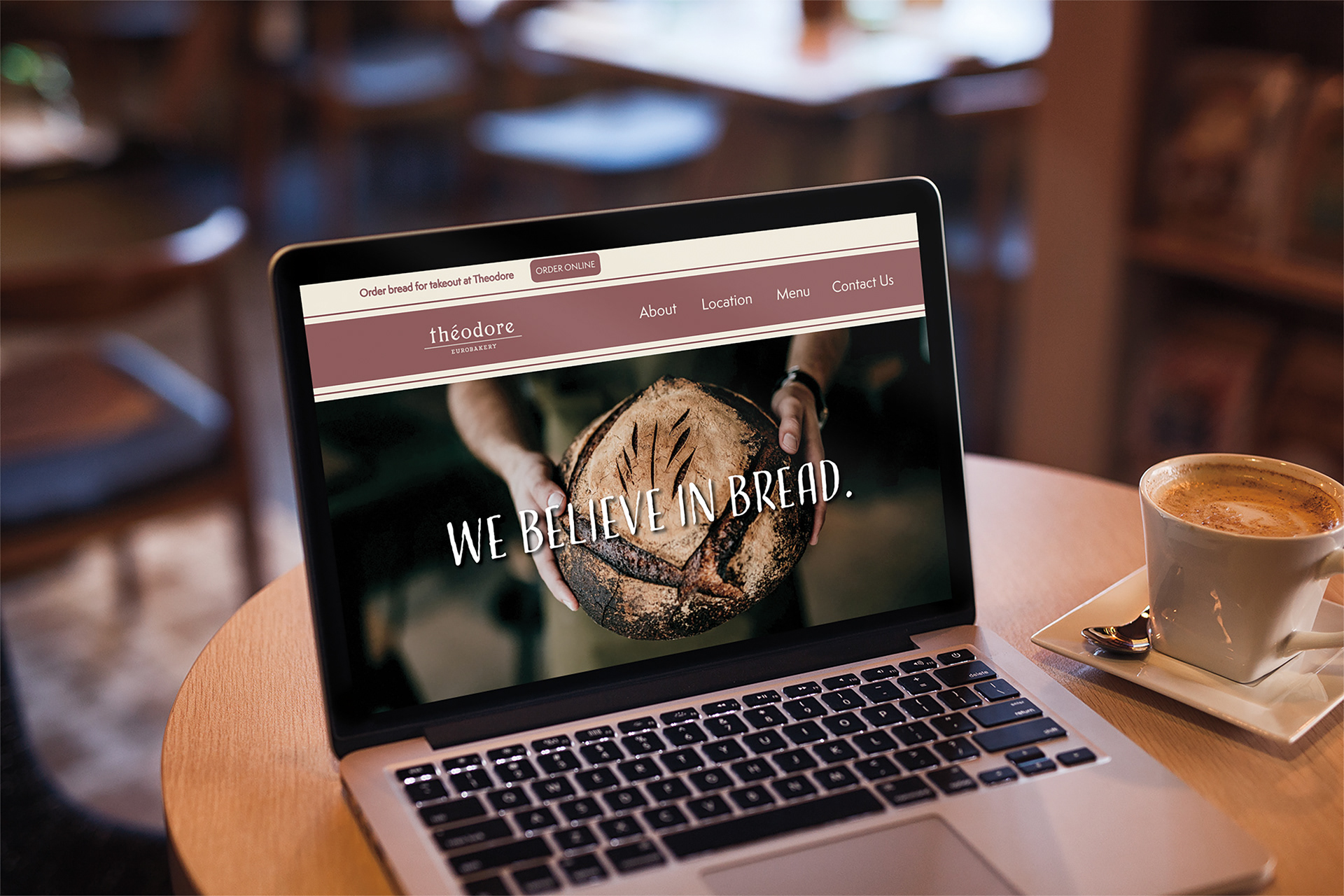
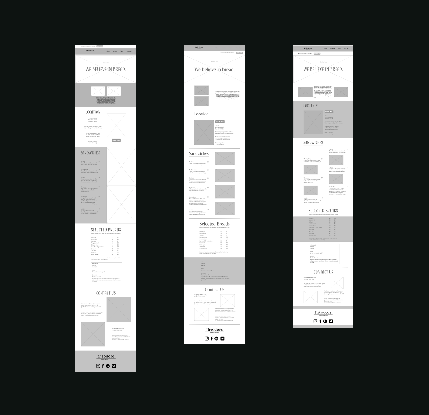
I was required to create 3 separate website wireframes incorporating different fonts, composition styles, and designs. This process took over 5 hours as I worked hard to come up with unique layouts and ultimately provide a design that complimented the
bakery elegance.
bakery elegance.